Bivariate Analysis
Category > Data Exploration
Mon 05 September 2022Bivariate Analysis
Welcome to the tutorial video on bivariate analysis of the AI Starter Kit on data exploration. In this video we explore the relationships between the variables analysed in the previous videos. Our main focus is on the factors that may have an influence on the number of trips and their duration.
As a starting point, let's inspect how bikes are used through the different days of the week.
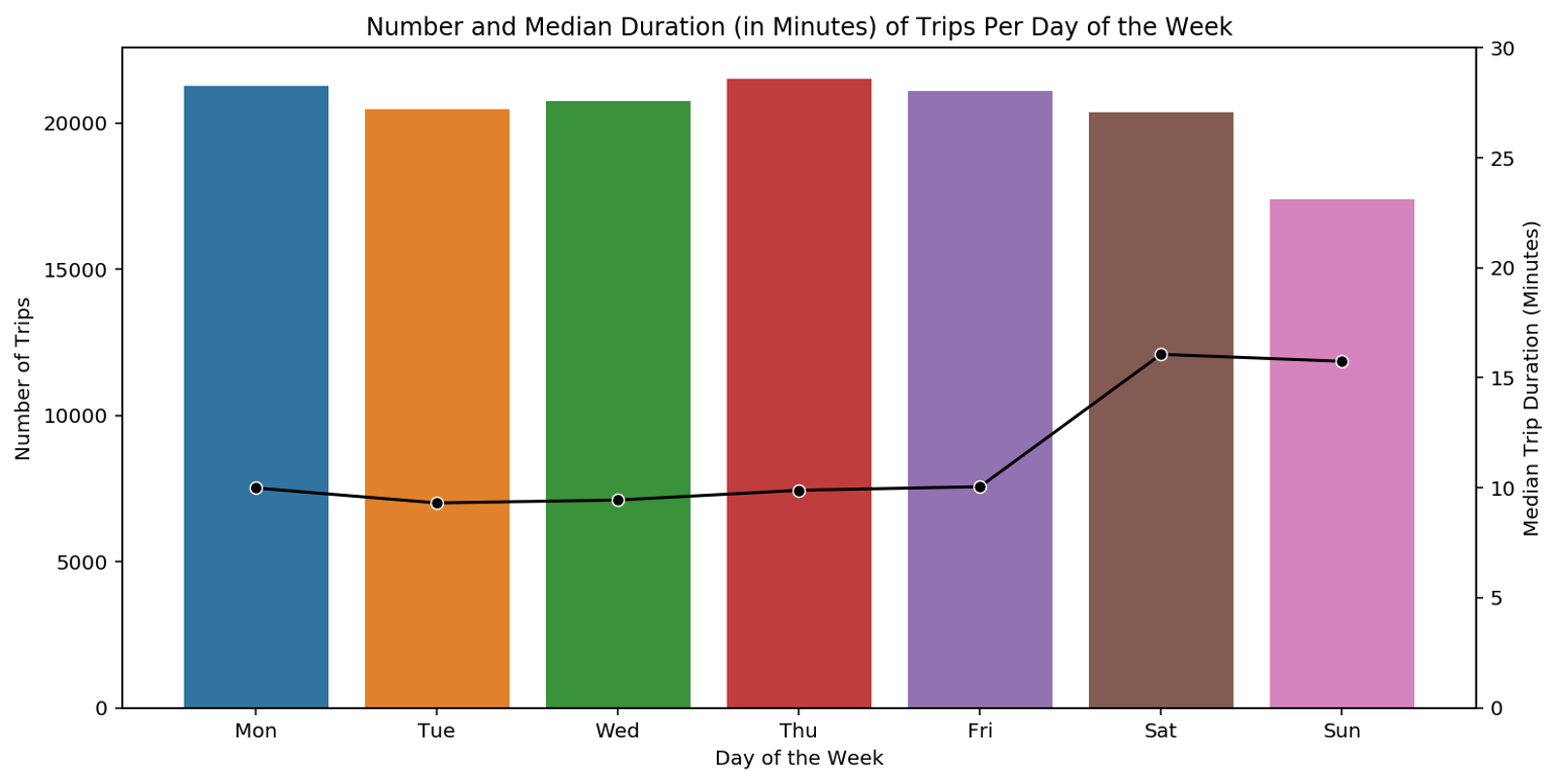
For this, we have a look at a bar plot where the bars represent the number of trips performed on the different days of the week. On top of the bar plot, we plot a line that depicts the median duration of trips for which the scale is given on the right-hand side. The bar plot shows that there are slightly less trips in the weekend, but that they tend to last longer than during weekdays. Across the single weekdays, the number of trips is similar. From this, we can draw the following hypothesis: On the one hand, we have leisure bikers who use the bike recreationally essentially during the weekend. On the other hand, we have weekday users who use the bike for commuting to work with comparably short trips of around 10 minutes.
Let's try to validate the previous hypothesis by looking at the number of trips per hour, distinguishing between weekdays and weekends.
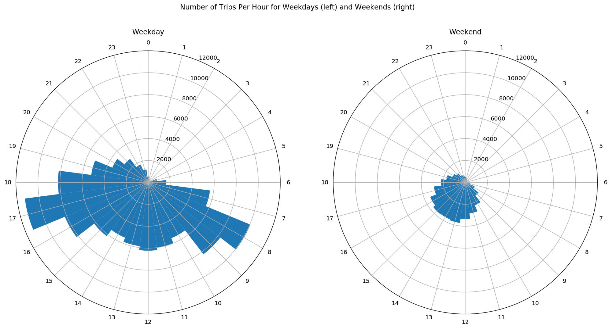
In this figure, we see the number of trips for weekdays on the left-hand side and for weekends on the right-hand side. The angular position in the circles represents the hour of the day while the blue bars show the number of trips for each hour. As weekends consist of two days only compared to 5 weekdays, these figures are misleading.
To have a clear visual comparison of the trips between weekdays and weekends, we need to normalize the data such that we have the number of trips per day. With this, we can avoid that wrong conclusions are drawn.
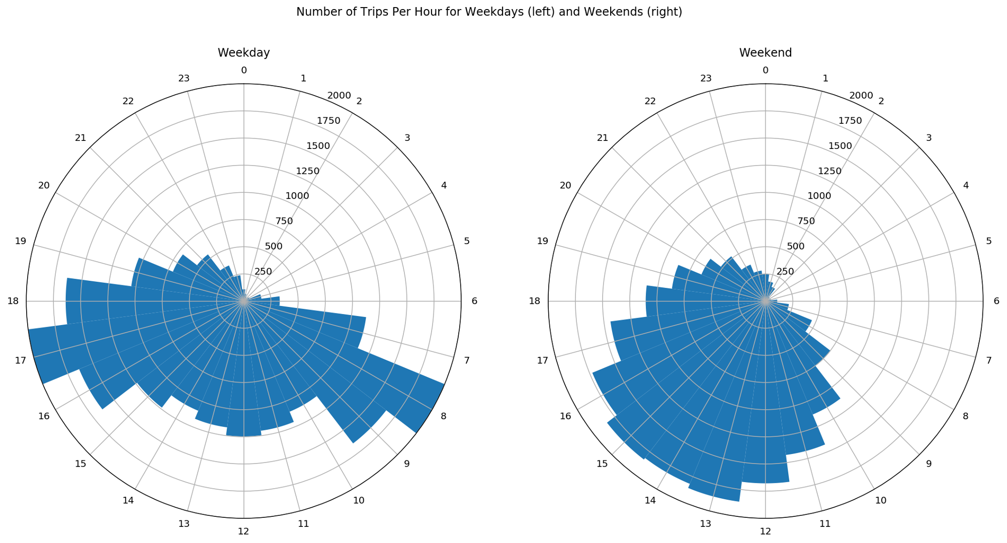
Now that the data is normalised, we clearly see two different patterns on weekdays and weekends: during weekdays, there are two peaks in the number of trips, occurring during the morning and evening rush hours while on weekends the distribution is much more uniform throughout the day or at least throughout the period comprised between the late morning and the early evening. These patterns support the hypothesis of recreational bike trips at the weekend compared to work- or school-related trips during weekdays.
We can further inspect the rush hours during weekdays to understand whether the rental locations share some similarities. As a first step, we divide the trips in two groups. On the one hand morning rush hours for which we select trips done on weekdays during 7 and 10 in the morning and on the other hand, evening rush hours with trips done on weekdays during 4 in the afternoon and 7 in the evening. Furthermore, for both groups we only retain the top 10 stations of arrival.
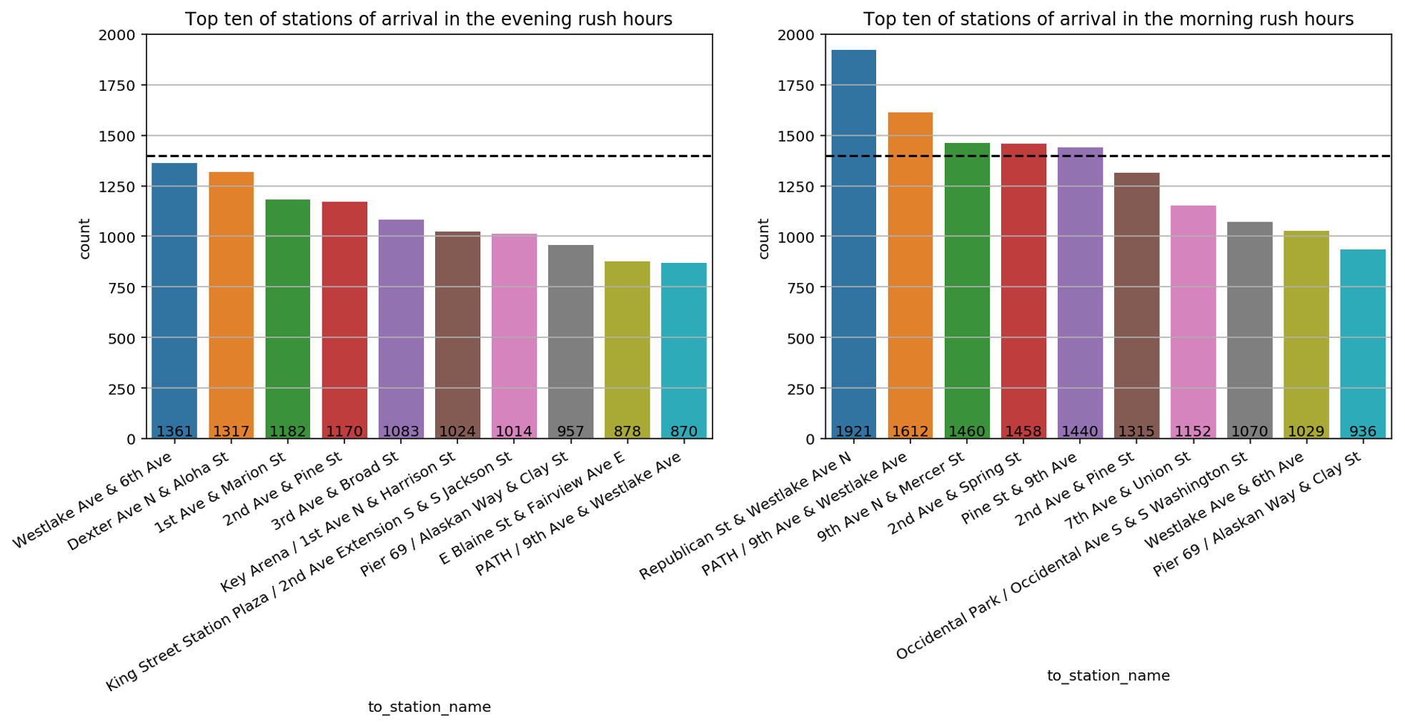
The resulting data is shown in this bar plot with the morning rush hour on the right- and the evening hours on the left-hand side. The y-axis describes how many times a given station was reached. A dashed horizontal line at 1400 is drawn to ease the comparison between the bar plots.
By comparing these bar plots, we discover that there are more stations of arrival that count more 1400 visits in morning rush hours than in the evening rush hours. This may indicate that bikers tend to converge in the morning rush hours toward a limited number of stations, like for example close to working places or schools, whereas in the evening rush hours bikers go in different directions like different residential areas. This hypothesis can also justify why stations that are quite popular in the morning rush hours such as Republican Street & Westlake Avenue North or 9th Avenue North & Mercer Street do not appear in the top ten stations of arrival in the evening rush hours and vice versa for Dexter Avenue North & Aloha Street or 1st Avenue & Marion Street. To further compare the difference between stations of arrival in the morning and evening hours, we plot them on the map of Seattle.
The green circles indicate stations that were reached in the morning rush hours while the red circles indicate those stations that were reached in the evening rush hours. The size of each circle is proportional to the number of times that the station was reached. What can we learn from this? First of all, in the area of South Lake Union - just below Lake Union - there are green stations but no red stations. This may mean that this location is more commonly reached by working bikers. Further, the green ones seem to be more 'condensed' in the downtown area when compared to the red stations. This may be due to the fact that red stations are reached after working hours. Part of the bikers may decide from 4 to 6 in the afternoon to go back home in more residential areas. Interestingly, none of the top 10 stations is located in the University district. This can have different reasons: Most obviously, students don’t bike to university, maybe because they live close by. Another reason might be that lecture hours are not exactly the same as working hours and finally, the number of non-students is simply bigger than the number of students.
Another influence on the biking behaviour is surely the weather. Even though, we don’t have the weather explicitly given in this tutorial, we know that the chance of rain and cold temperatures in a state like Washington is much higher in the winter months compared to the summer months.
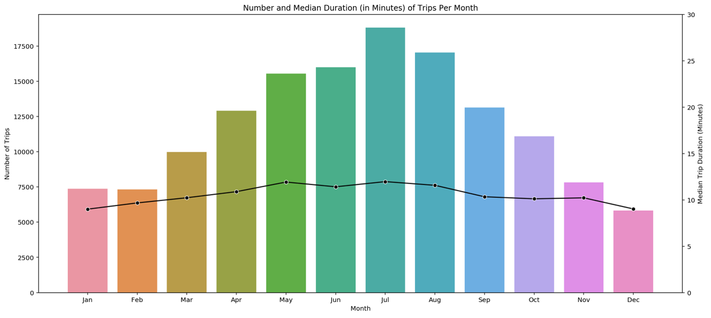
For this reason, it is enough to plot the number of trips against the months. The resulting pattern is as expected: More than double as many bikes are used in summer compared to winter. The most-frequented month is July. Interestingly, the mean trip duration given by the black line is more or less constant during the year.
Let’s see whether on the other hand the trip duration is influenced by the age of a biker.
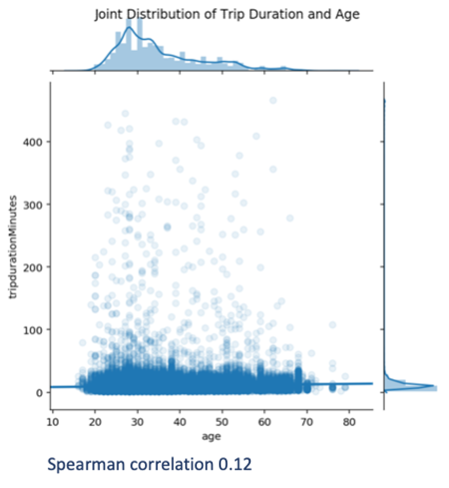
For this purpose, we visualise the joint distribution of these two variables by means of a scatterplot and compute their Spearman's correlation. This correlation is chosen to measure the monotonic relationship between the variables. The Spearman's correlation is chosen in place of the Pearson's correlation since the latter is not robust to outliers.
As we can see, there is a broad age dispersion over a relatively narrow distribution of trip durations. Longer-lasting trips occur for many ages. Not surprisingly, the Spearman's correlation is close to zero, hence the age does not seem to play an important role in the duration of trips. Note that driving speed might also play a role, but as we only know where each trip started and ended, we cannot estimate the speed, and hence no further analysis can be done.
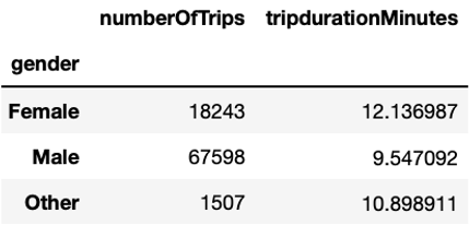
Another factor that could influence the trip duration is gender. As we can see, women bike longer with an average duration of about 12 minutes per trip compared to men with an average duration close to 10 minutes per trip. The fact that mean duration of the Unknown group is much longer - namely 36 minutes – suggests that short-term users do not use the bikes for commuting, but rather for leisure purposes.
Additionally, we can have a look at the relationship between gender and age. In the univariate analysis, we highlighted a peak at 28 years. In the present analysis, we can further investigate it by seeing whether or not it is consistent across genders.
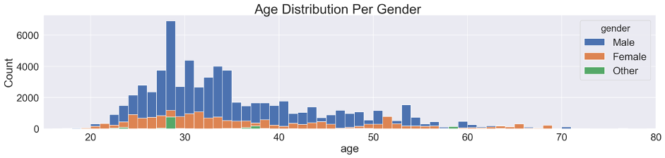
We can see that the age distribution is relatively similar between men and women, with a more prominent bike usage around 30 years compared to younger and older ages. The peak at 28 years only clearly stands out for men and Other and remains difficult to interpret.
Another relation that can support our hypothesis on commuters is given by the weekday of the trip and the type of user. Bike users can be distinguished based on the fact that they have an Annual Membership or a Short-Term Pass.
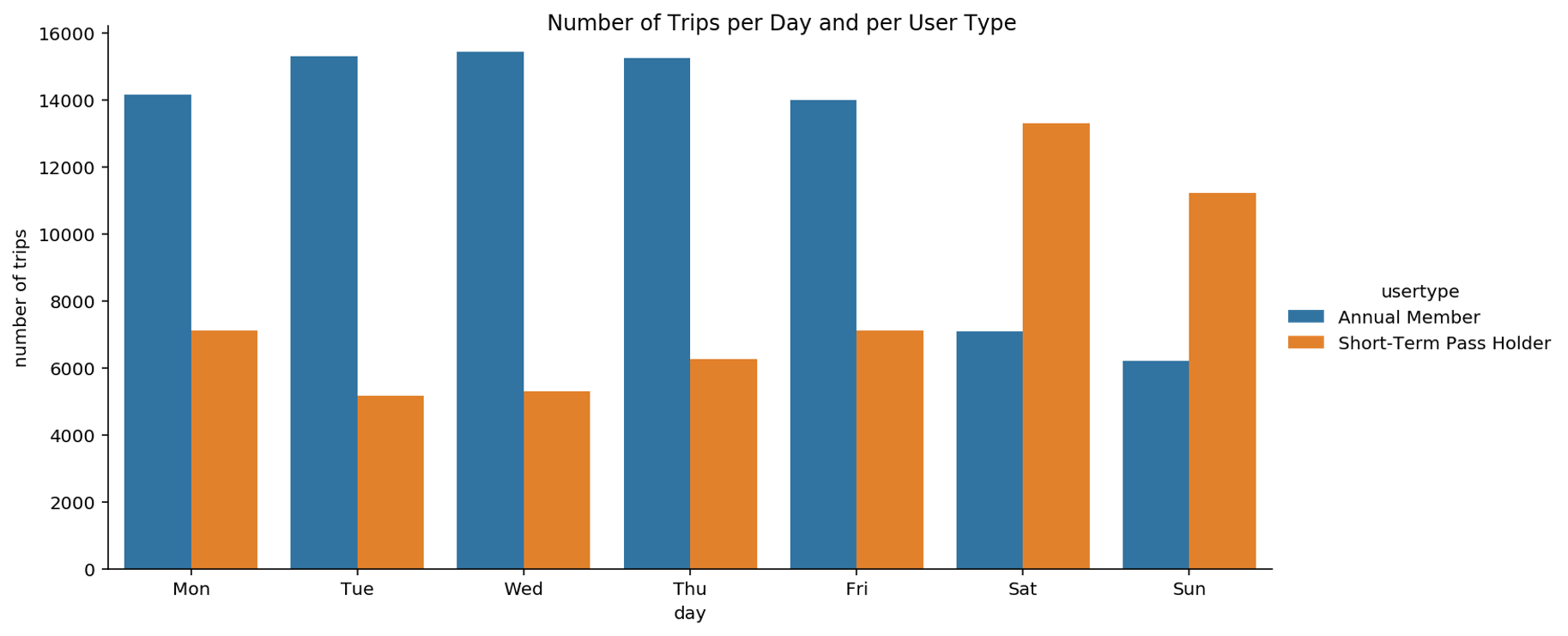
We notice that Short-Term Pass users are more frequently riding a bike on weekends and much less on weekdays, as opposed to annual members. This suggests that Pronto's choice of offering two types of subscriptions meets the needs of these two types of users. This supports the hypothesis that leisure bikers may often subscribe to a Short-Term Pass whereas bikers with an annual membership are probably commuters that need a bike for commuting to work.
From the univariate analysis we know that the bike-sharing service is more often used by men than by women. Here we explore how this usage is over the days of the week.
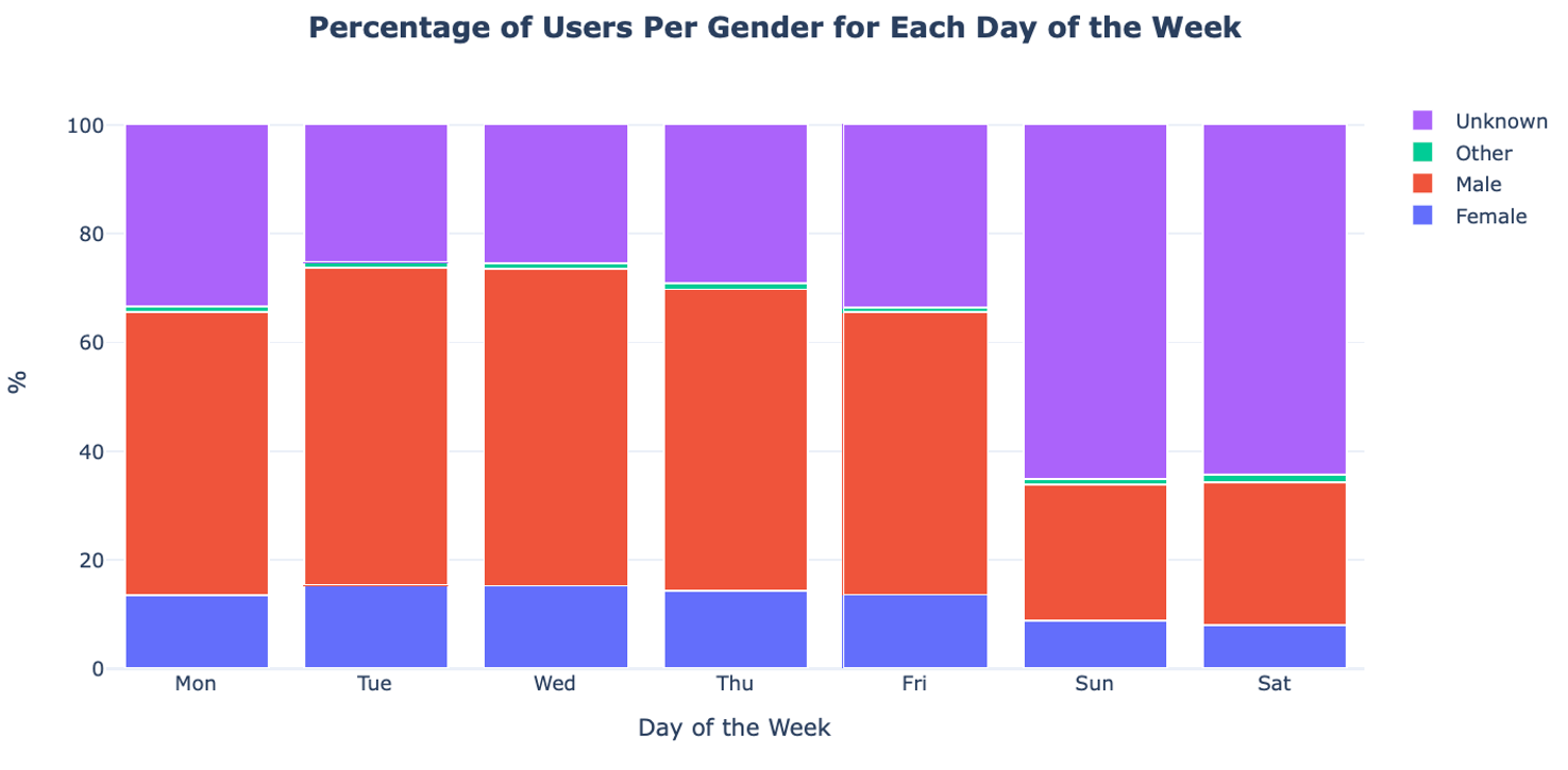
In the plot we see that there is no obvious difference in the gender ratio. The most noteworthy difference is the increase of the Unknown gender category over the weekend. As we already saw, this can be explained by the fact that this group represents Short-Term Pass holders, which travel mostly on weekends.
It is possible that there is a relationship between a biker's gender and the location where the biker is going. For this, we analyse whether there exist stations of arrival that are more popular for one gender than for the others. To this end, we split the trips according to gender. For each group, we compute how frequently each station was reached. Finally, for each station, we compute the ratio between the frequency of arrival for men and women. More specifically, we define the two following ratios: the ratio between the visit frequency for women compared to men and the inverse, namely, the ratio between the visit frequency for men compared to women.
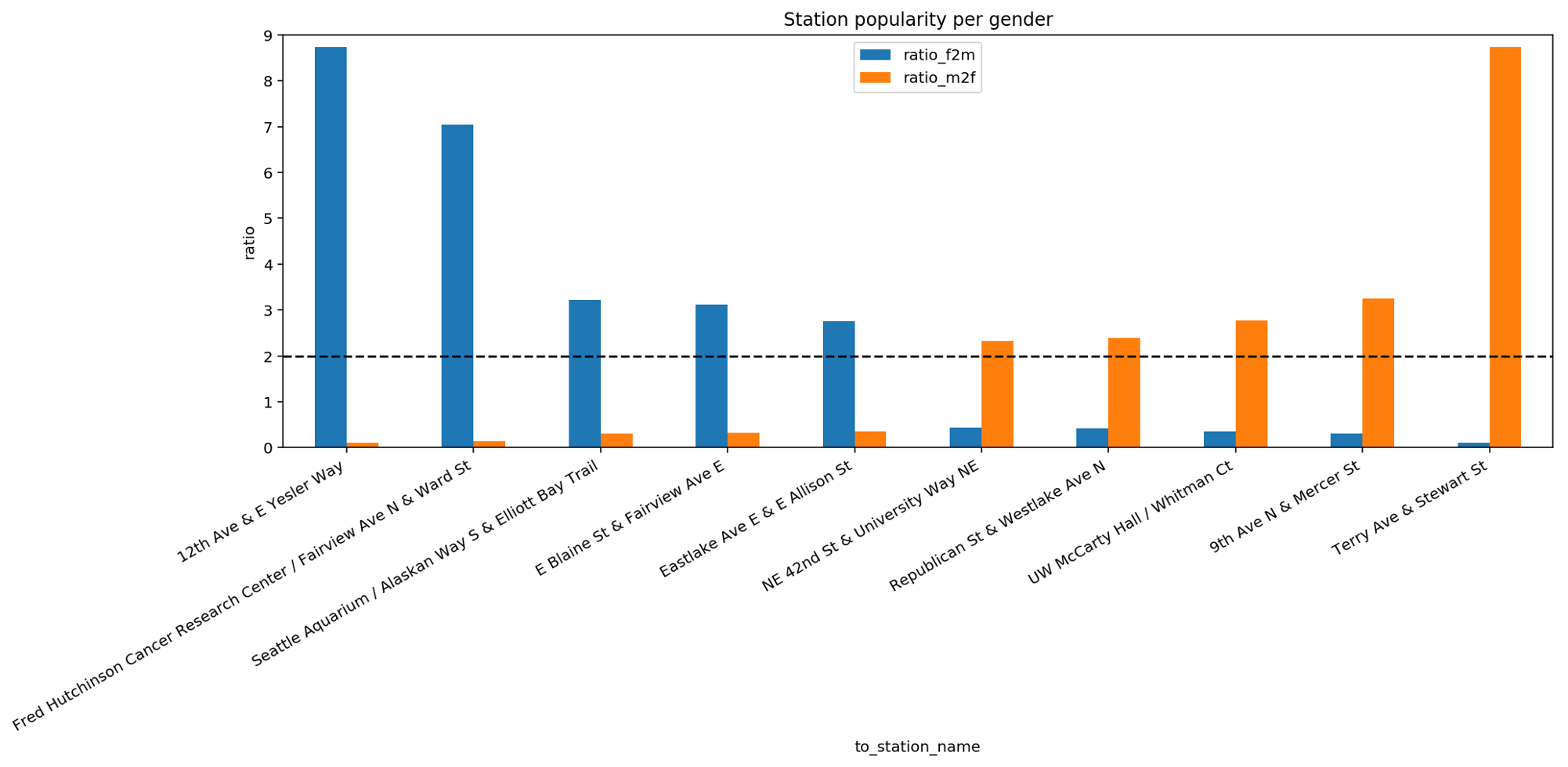
This bar plot reports the top 5 and bottom 5 stations with the highest difference in ratio. If we focus our attention on the dashed line we can see that the top 5 stations for women are at least twice as popular among women than among men. This popularity is quite striking especially for the first two stations on the left. Similar considerations are valid for the bottom 5 stations that are more popular among men than among women. The existence of such gender-related bias in the reached destinations is interesting to explore since it allows to make further assumptions on how city services or workplaces are organized in Seattle. These aspects will be investigated in the next video during the multivariate analysis.
From the univariate analysis we already know that some stations are more popular than others in terms of arrivals. Now, we further inspect this aspect by checking for each station how many bikes arrive and depart. This analysis is important to identify unbalanced stations, namely stations that Pronto needs to take special care of when redistributing bikes among stations.
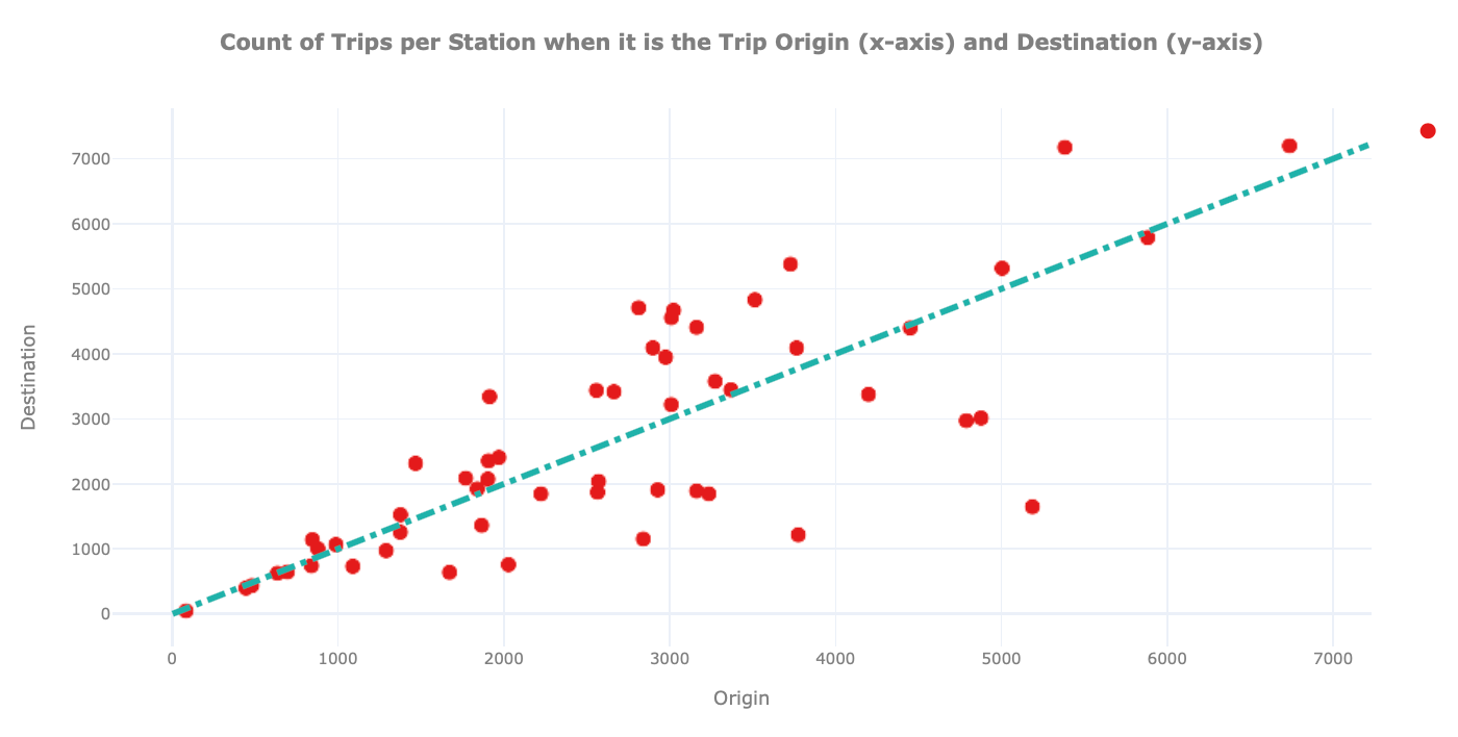
In this plot we show for each station on the x-axis how many times it was the origin and on the y-axis how often it was the destination of a trip. We also include a dashed straight line to easily identify hub stations where the number of arrivals and departures is similar.
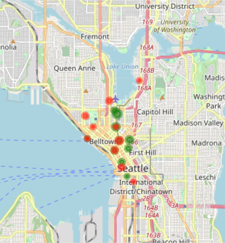
We can observe the existence of unbalanced stations, namely stations that are depicted far away from the diagonal. A station can be unbalanced because many users pick up bikes from there, but few drop them off, or vice versa. From the graph above it is hard to extract further information on these stations. For this reason, we mark on the map of Seattle where these stations are located. To spot insights related to unbalanced stations, we draw stations using different colours and sizes: the green circles show unbalanced stations with more arrivals than departures. The red circles show unbalanced stations with more departures than arrivals. For both holds, the bigger its size, the higher the unbalance.
To ease the visualisation, we only plot the top 10 (unbalanced) stations.
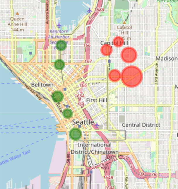
As we can see on the map, the unbalanced stations with highest amount of departures - hence the red circles – are all located on Capitol Hill while the unbalanced stations with highest amount of arrivals - the green circles - are all located downtown. This last finding opens another possible explanation to justify why there are many stations of arrival downtown: bikers may be more prone to use bikes to move downhill. To explore this hypothesis, we again plot the unbalanced stations but now using the elevation from the sea level for the size of the circle.
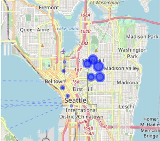
Comparing this map to the one before, we can confirm our hypothesis, namely that unbalanced stations with more departures than arrivals are the ones located uphill while unbalanced stations with more arrivals than departures are the ones located downhill. This observation provides useful insights for the Pronto system. Indeed, in case of the opening of new stations, we can already foresee whether the station would be unbalanced or not and take this into account for handling the logistics.
With this bivariate analysis, we learnt a lot about the users’ behaviour. In the next video, we will go one step further and perform a multivariate analysis hence take more than two variables into account to find relations between them.
Authors: EluciDATA Lab
Permanent URL